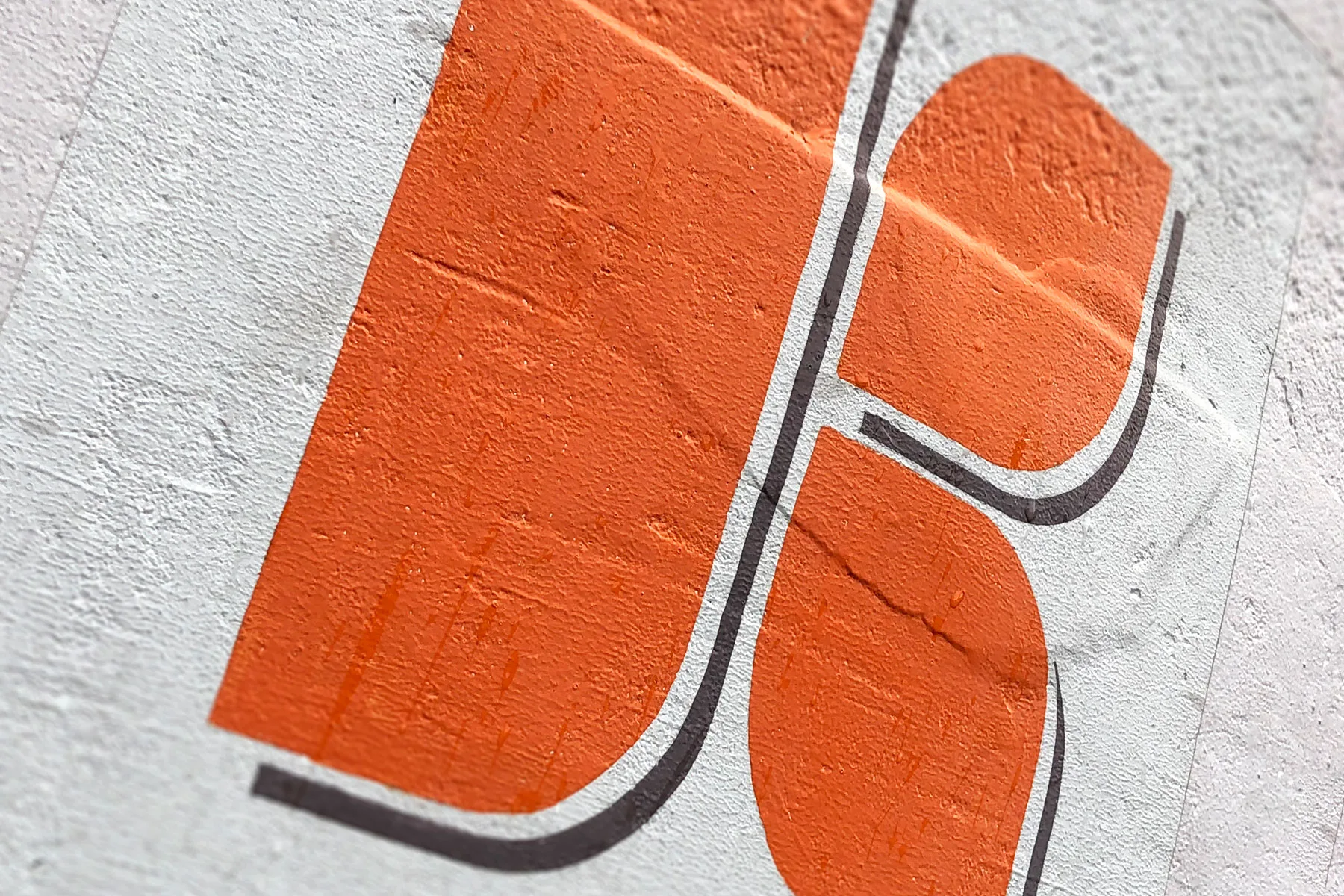
A mark built from simple parts
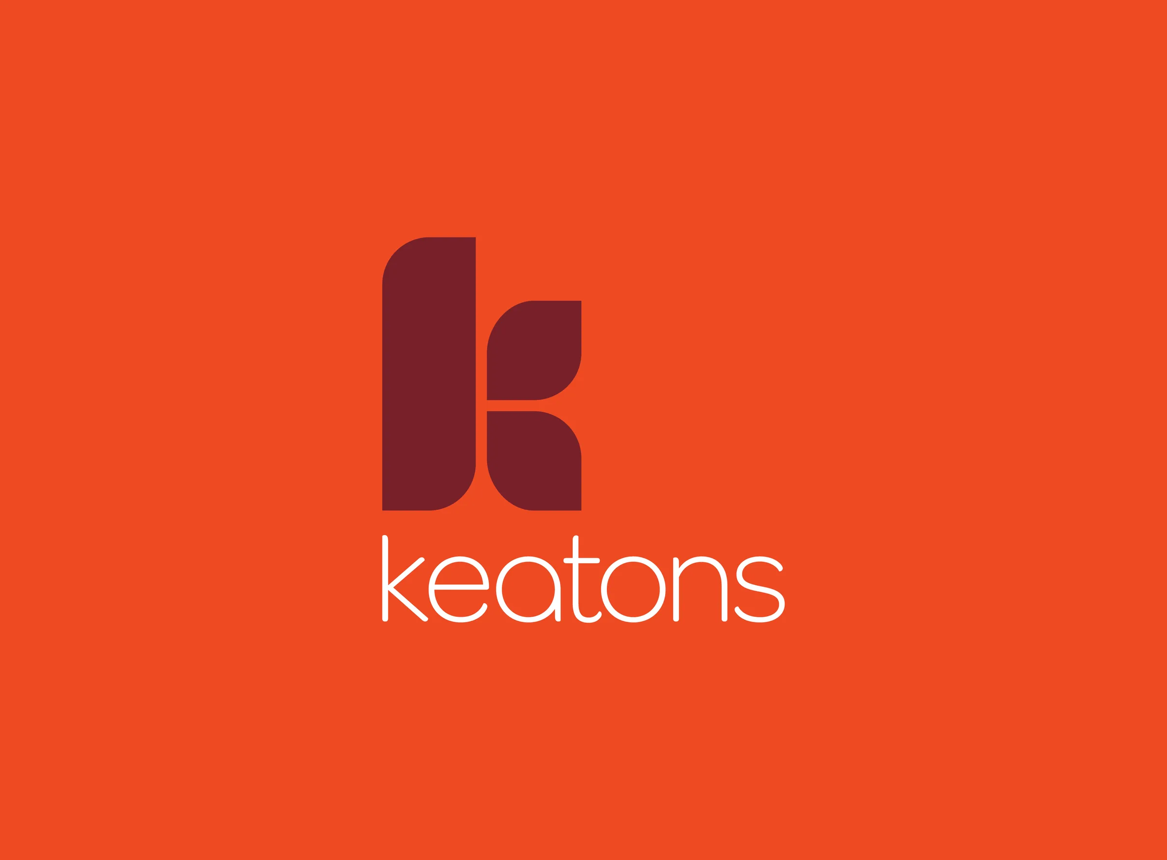
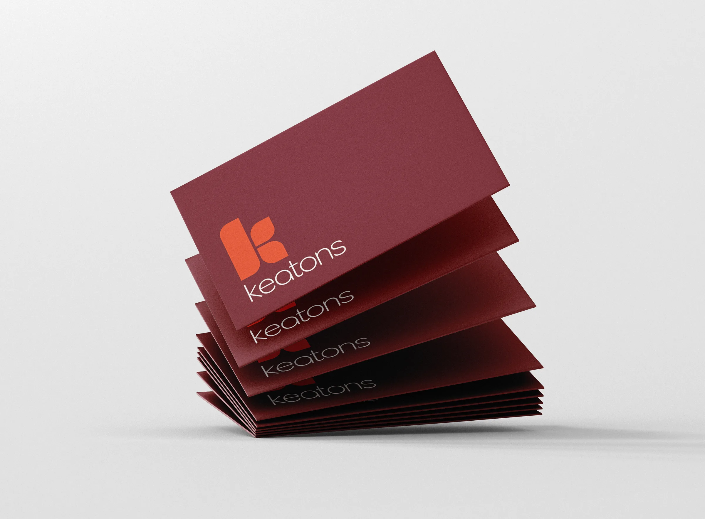
Workshops with the Keatons team set the brief: a modern identity that could stand alongside the bigger agencies without losing its local character. The direction was refined over several rounds into a K made from three rounded forms, a tall stem and two leaf-like shapes, set above a light, rounded lowercase wordmark. A deep burgundy and a warm orange give it a palette that is easy to spot from across the street.
A system of reusable parts
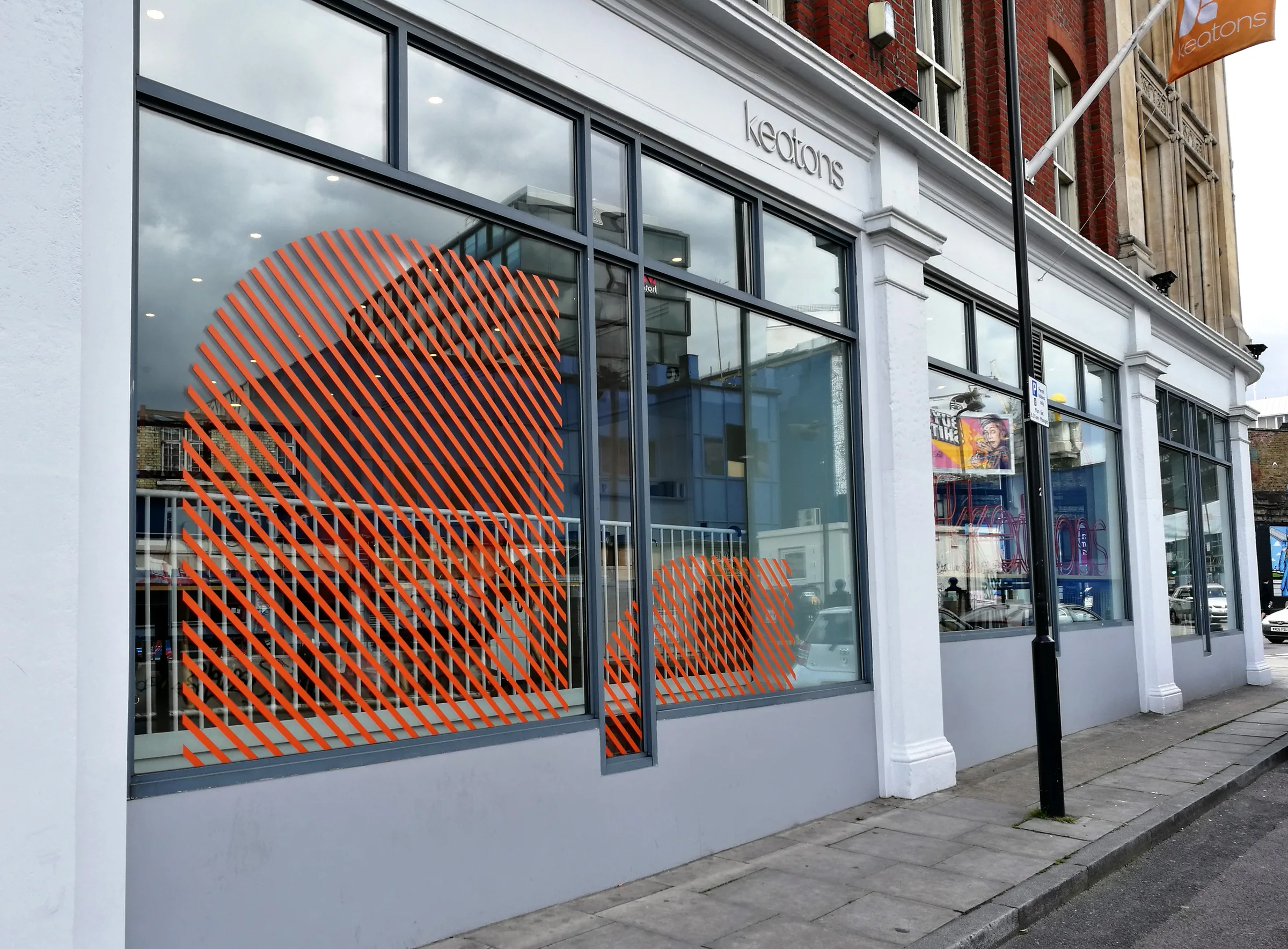
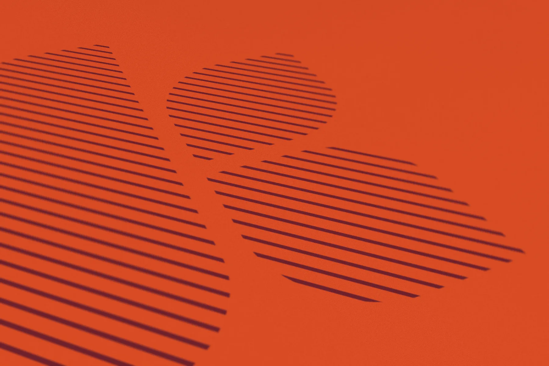
The three shapes of the K work on their own as well as together. Filled with horizontal stripes they become a pattern for envelopes, backgrounds, and shop windows. Each piece can be cropped, scaled, or recombined, so the brand stays recognisable without the full logo on every surface.
Carrying the brand
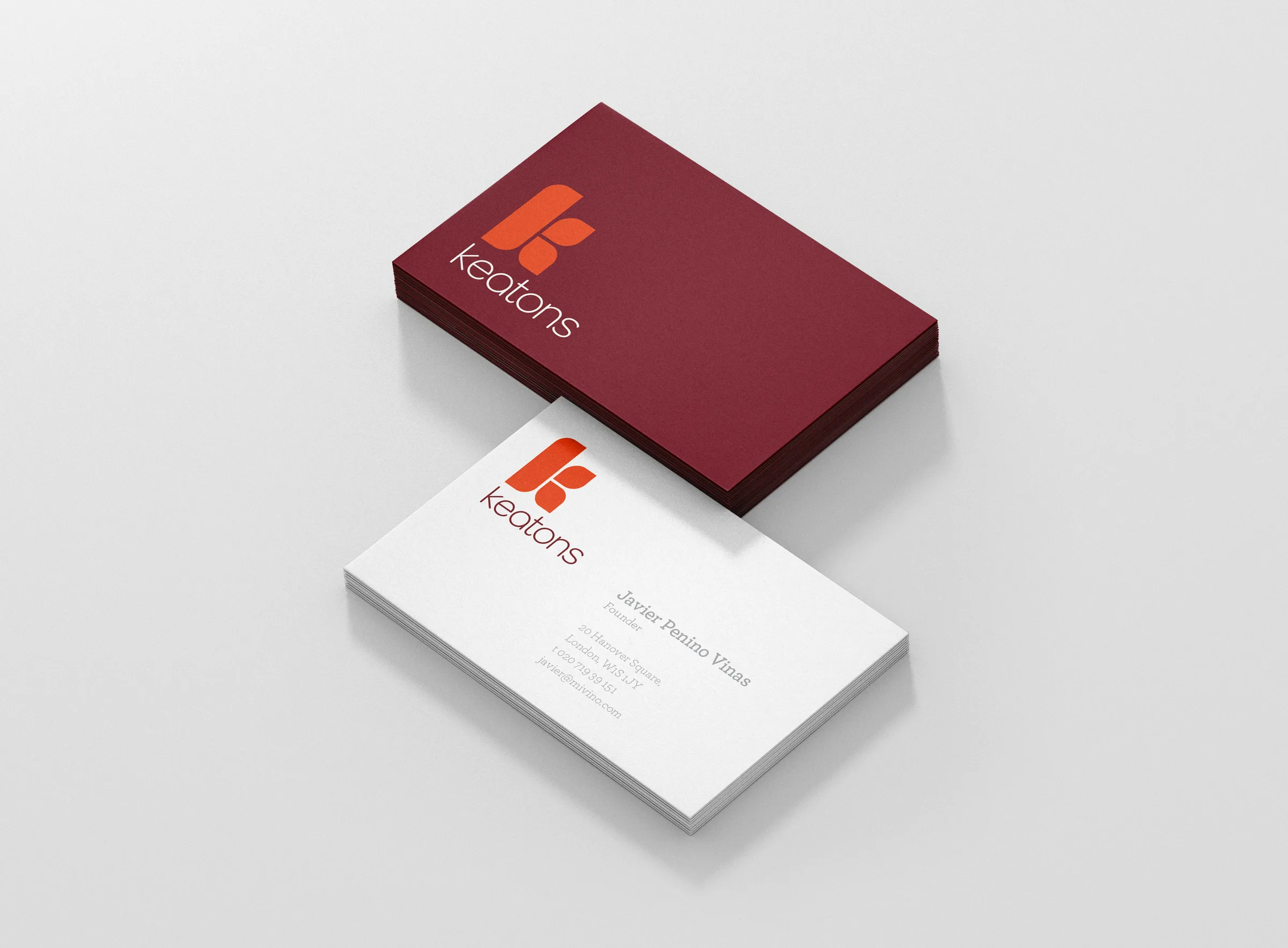
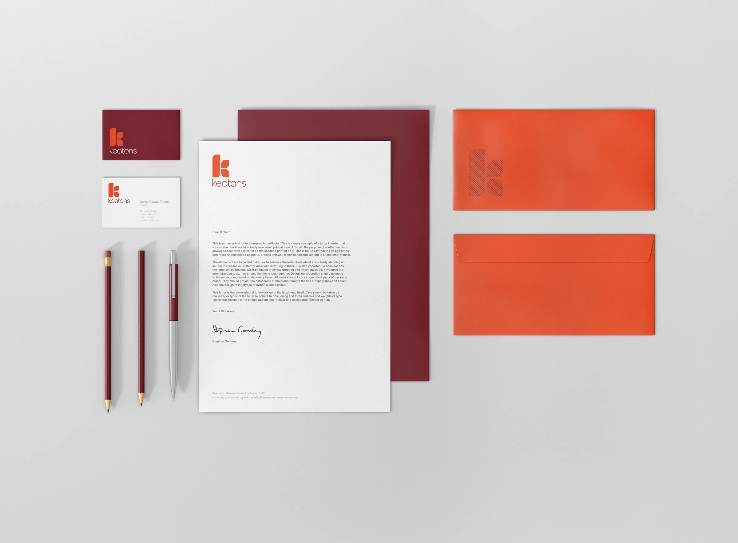
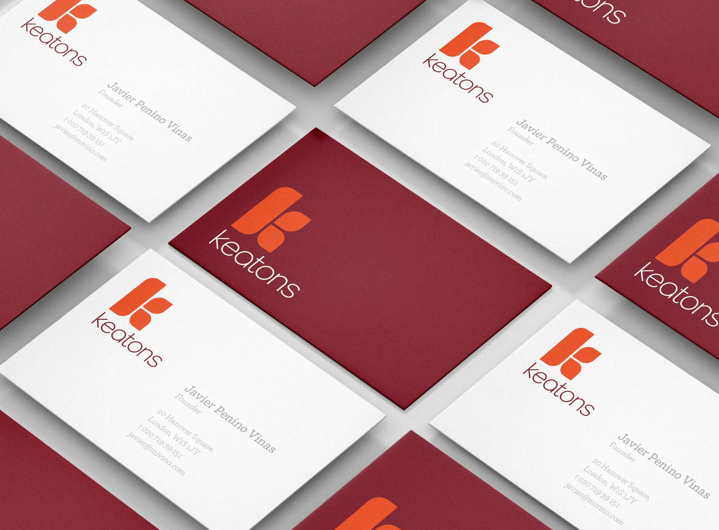
Across stationery the system switches between burgundy and white cards, orange envelopes with a striped K, and letterheads that keep the mark small and the typography quiet.
On the streets of East London
Keatons now competes on equal footing with the larger agencies around it. The striped pattern wraps its shop windows, the mark hangs from flagpoles above the pavement, and the K is painted large on walls. Around Bow and Hackney in particular, the logo has become a familiar part of the streetscape.